







- 首頁
- Blog
- Online Store Design Guide: 5 Core Elements, Product Page Planning, and Continuous Optimization Methods
Online Store Design Guide: 5 Core Elements, Product Page Planning, and Continuous Optimization Methods
2025 / 05 / 23
Author: Web Design Team, Arachne Group Limited | Reviewed by: Edwin, Marketing Director | Last Updated: October 12, 2026
Online store design is far more than just selecting colors and layout templates. Customers need to find products quickly, easily understand pricing and shipping details, and complete payment smoothly. If any step along the way is unclear, the shopping experience can easily fall apart.
This guide breaks down five core components of e-commerce web design and provides a step-by-step checklist from planning to launch. At the end of the article, we also introduce several visual tools to help generate image and video assets. However, actual design effectiveness depends on factors like product type, target audience, pricing, and traffic sources—requiring continuous validation through site data and user feedback.
Key Takeaways:
Successful e-commerce web design goes beyond visual appeal; it focuses on reducing friction and increasing conversion rates (CVR). This complete design guide covers 5 core elements, a 6-step planning workflow, 3 visual creation tools, and answers to FAQs to help merchants build high-converting online stores.
5 Core Elements of E-commerce Web Design (UI/UX Strategy)
Consistent Brand Identity: Standardize colors, typography, and styling. Product photos should clearly display fine details and practical use cases without misleading customers through heavy photo editing.
Clear Navigation and On-Site Search: Utilize intuitive category names and hierarchies, offer flexible filtering options (e.g., size, price), and avoid "zero search results" dead-end pages.
High-Converting Product Detail Pages (PDP): Address key pre-purchase questions (specifications, inventory levels, shipping fees, return policies) and display authentic customer reviews.
Seamless Mobile Experience & Checkout: Prioritize mobile-first optimization, simplify checkout form fields, maintain transparent fee structures, and ensure fast page speed.
Data-Driven Continuous Optimization (CRO): Identify high drop-off funnel steps, perform single-variable A/B testing, and make redesign decisions based on data rather than subjective preference.
6-Step Checklist for Building an Online Store from Scratch
Gather Customer Data → Map Out Sitemap → Sketch Page Wireframes → Prepare Brand Assets → Test End-to-End Shopping Flow → Post-Launch Data Monitoring & Iteration
Quick Comparison of Visual Creation Tools
Canva: Ideal for promotional banners and social media assets; features quick background removal.
PhotoScissors: Focused specifically on product image background removal and transparent background processing.
PowerDirector: Best for editing product demonstration videos and adding subtitles.
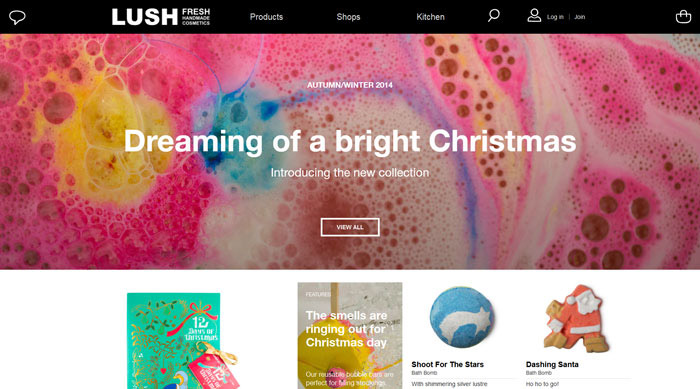
Before starting your design, answer three fundamental questions: Who are your primary customers? What do they want to accomplish on your website? What specific action do you want them to take? Your answers will dictate homepage content, product categorization structure, page hierarchy, and the overall checkout journey.
For example, if your shoppers usually compare technical specifications first, the product detail page must make dimensions, materials, features, and key differences easy to review. If selecting specific colors or sizes is necessary, variation pickers must be clear and straightforward. Design should never exist purely for visual flair; it must directly align with real purchasing decisions.
First, define your brand’s primary color scheme, font pairing, image aesthetic, and button styling, then apply them consistently across the homepage, category pages, product pages, and promotional graphics. When customers browse through different pages, they should experience a unified brand identity rather than feeling like they navigated to an entirely different site.
Visual consistency doesn't mean every page must look identical. The homepage can highlight your overall brand positioning and flagship products, while product detail pages should keep the focus entirely on the item itself. When choosing colors and fonts, pay close attention to contrast and readability to prevent text from blending into backgrounds or making primary CTA buttons hard to spot.
Product photos need to clearly show appearance, build details, scale, and real-life context. If customers need to evaluate products from multiple angles, provide multi-angle image galleries or short video demonstrations. Use clear context shots to avoid giving buyers false expectations regarding color hue, actual size, or functionality.
Category names should use terminology that customers naturally understand, organized into logical hierarchies based on product types or shopping needs. Overly granular categories cause choice overload, while too few categories force shoppers to sift through endless listing pages. Start with your most frequently browsed categories and refine them over time based on catalog size and real user feedback.
For larger catalogs, implement robust on-site search, filtering, and sorting capabilities. Filters should reflect specific product attributes—such as size, color, and price range for apparel, or dimensions, material, and usage scenarios for home goods. If a search yields no exact matches, offer relevant alternative categories or suggested items instead of displaying a blank page.
The primary objective of a product detail page is to provide buyers with sufficient information to make an informed decision. Beyond the item title and price tag, clearly display specifications, materials, sizing, usage instructions, care guides, real-time inventory levels, shipping timelines, and return policies.
The "Add to Cart" button should be prominently placed, and variant options must be clearly presented. If prices change based on configuration or additional fees apply, disclose these before checkout. Authentic customer reviews, FAQ accordions, and real user photos help fill in information gaps, but ensure review content remains genuine and distinct from merchant-provided descriptions.
A large portion of customers browse e-commerce stores on mobile devices. Prior to launching, test the user experience directly on actual smartphones rather than relying solely on desktop previews. Verify that typography remains legible, images aren't cropped awkwardly, buttons are easy to tap with a thumb, and selecting product options or reviewing the cart feels natural.
The checkout step should clearly summarize items, quantities, shipping rates, discounts, and total payable amounts to avoid unexpected charges at the final step. Collect only essential fields required to fulfill the order, and clearly outline accepted payment methods, delivery options, and return procedures throughout the flow.
Page loading speed significantly impacts user retention. Audit image file sizes, eliminate unnecessary third-party scripts or plugins, and use performance diagnostic tools to identify lagging pages. Avoid relying solely on synthetic performance scores; perform real-world testing across common mobile devices and network conditions.
Launching your online store isn't the end of design—it's the beginning. Regularly monitoring landing pages, popular product views, high drop-off points, and top-converting pages will help you prioritize high-impact optimizations.
If a product page receives strong traffic but suffers from low cart additions, evaluate whether product details are thorough enough, if pricing or shipping fees are transparent, or if the buy button is easily visible. If shoppers abandon carts, audit checkout steps, available payment gateways, or unexpected extra fees that might cause hesitation.
Focus each design test on a single variable at a time, documenting changes and observation periods. Don't assume a new color scheme or layout layout will automatically boost conversion rates just because it looks visually pleasing; validate decisions using analytics, user feedback, and structured testing.
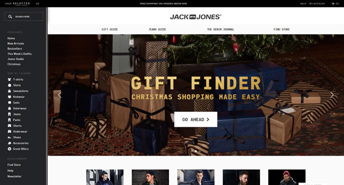
Compile details on core products, frequent customer inquiries, and critical information buyers need prior to placing an order.
Outline essential pages—including homepage, product categories, product detail pages, shopping cart, checkout, and service policy pages—then plan logical internal linking.
Establish information hierarchy and primary call-to-action (CTA) button placement across key pages before committing to brand colors, imagery, or decorative styling.
Standardize image aspect ratios, background treatments, and graphic styles to ensure product assets accurately reflect physical items.
Walk through the entire journey across both mobile and desktop—browsing, picking variants, adding to cart, and checking out—to uncover friction points.
Regularly analyze traffic data, search queries, product interactions, and checkout funnels to continuously resolve usability issues in priority order.
Design tools streamline content creation, but they cannot replace thorough product cataloging, sitemap planning, or conversion flow testing. Select tools based on workflow needs, confirming output formats, licensing terms, and plan limits align with your operational scale.
Canva is well-suited for creating promotional graphics, social media posts, and supporting web assets. Its platform offers built-in background removal, walking users through uploading images, removing backgrounds, and exporting PNGs. Specific advanced features or processing limits depend on your subscription plan, so check current official details before adopting.
When using generated imagery for product catalogs, inspect product edges, colors, and shadows carefully to confirm the asset doesn't distort actual product appearance.
PhotoScissors specializes in isolating subjects from background imagery to produce transparent product photos or swap background colors. Official documentation details color-marking techniques for background selection and handling semi-transparent edges. Actual results vary based on original image lighting, background contrast, and edge complexity.
After removing backgrounds, zoom in to inspect fine details like hair strands, transparent materials, and border edges. If product appearance or coloring is altered unnaturally, avoid using the output on official product listing pages.
PowerDirector provides video editing suited for short product demos or promotional reels. Features listed on CyberLink's product pages include video trimming, subtitling, background removal, and auto-reframing. Feature availability varies by software edition or subscription plan, so review official specifications prior to video production.
Ensure short-form video content quickly introduces the item before demonstrating main features or real-world use cases. Use clear, high-contrast captions and adapt aspect ratios to match your target distribution channel. Videos should authentically portray product performance without relying on heavy effects that obscure limitations or set false expectations.
There is no single design layout or element that fits every online store. Generally speaking, ensuring customers can find products, digest specifications, confirm delivery/payment terms, and check out seamlessly should take top priority. Precise priorities should be determined by product category and customer expectations.
Not necessarily. Small online businesses can start with pre-built e-commerce platform templates alongside basic graphic utilities, expanding capabilities as their brand scales. If your business requires highly customized page layouts or specialized interactive features, evaluate professional design and custom development services.
Document baseline metrics and key issues prior to launching redesigns—such as PDP engagement rates, add-to-cart ratios, and completed order counts. Compare post-launch data under similar market conditions while gathering qualitative customer feedback. Traffic sources, promotions, and seasonal fluctuations can also sway numbers, so avoid attributing short-term metric shifts to a single visual update without broader context.
An effective online store empowers customers to understand your brand identity, locate desired products, compare features, and complete orders effortlessly. From brand styling and navigation down to product pages and checkout, every design choice must serve a functional shopping objective rather than mere visual decoration.
If you are planning a new store launch or seeking to optimize user experience on an existing website, start by compiling your most common customer inquiries, then review your key pages against the checklist in this guide. For further e-commerce design or digital marketing support, contact HKWEB to explore service scope, workflows, and solutions tailored to your business needs.
Phone: 852-37499734
Email: [email protected]
WhatsApp: 6315 1000
Online store design is far more than just selecting colors and layout templates. Customers need to find products quickly, easily understand pricing and shipping details, and complete payment smoothly. If any step along the way is unclear, the shopping experience can easily fall apart.
This guide breaks down five core components of e-commerce web design and provides a step-by-step checklist from planning to launch. At the end of the article, we also introduce several visual tools to help generate image and video assets. However, actual design effectiveness depends on factors like product type, target audience, pricing, and traffic sources—requiring continuous validation through site data and user feedback.
Key Takeaways:
Successful e-commerce web design goes beyond visual appeal; it focuses on reducing friction and increasing conversion rates (CVR). This complete design guide covers 5 core elements, a 6-step planning workflow, 3 visual creation tools, and answers to FAQs to help merchants build high-converting online stores.
5 Core Elements of E-commerce Web Design (UI/UX Strategy)
Consistent Brand Identity: Standardize colors, typography, and styling. Product photos should clearly display fine details and practical use cases without misleading customers through heavy photo editing.
Clear Navigation and On-Site Search: Utilize intuitive category names and hierarchies, offer flexible filtering options (e.g., size, price), and avoid "zero search results" dead-end pages.
High-Converting Product Detail Pages (PDP): Address key pre-purchase questions (specifications, inventory levels, shipping fees, return policies) and display authentic customer reviews.
Seamless Mobile Experience & Checkout: Prioritize mobile-first optimization, simplify checkout form fields, maintain transparent fee structures, and ensure fast page speed.
Data-Driven Continuous Optimization (CRO): Identify high drop-off funnel steps, perform single-variable A/B testing, and make redesign decisions based on data rather than subjective preference.
6-Step Checklist for Building an Online Store from Scratch
Gather Customer Data → Map Out Sitemap → Sketch Page Wireframes → Prepare Brand Assets → Test End-to-End Shopping Flow → Post-Launch Data Monitoring & Iteration
Quick Comparison of Visual Creation Tools
Canva: Ideal for promotional banners and social media assets; features quick background removal.
PhotoScissors: Focused specifically on product image background removal and transparent background processing.
PowerDirector: Best for editing product demonstration videos and adding subtitles.
What Key Problems Should E-commerce Design Solve First?
Before starting your design, answer three fundamental questions: Who are your primary customers? What do they want to accomplish on your website? What specific action do you want them to take? Your answers will dictate homepage content, product categorization structure, page hierarchy, and the overall checkout journey.
For example, if your shoppers usually compare technical specifications first, the product detail page must make dimensions, materials, features, and key differences easy to review. If selecting specific colors or sizes is necessary, variation pickers must be clear and straightforward. Design should never exist purely for visual flair; it must directly align with real purchasing decisions.
5 Core Elements of E-commerce Web Design
1. Maintain Brand Consistency while Highlighting Products
First, define your brand’s primary color scheme, font pairing, image aesthetic, and button styling, then apply them consistently across the homepage, category pages, product pages, and promotional graphics. When customers browse through different pages, they should experience a unified brand identity rather than feeling like they navigated to an entirely different site.
Visual consistency doesn't mean every page must look identical. The homepage can highlight your overall brand positioning and flagship products, while product detail pages should keep the focus entirely on the item itself. When choosing colors and fonts, pay close attention to contrast and readability to prevent text from blending into backgrounds or making primary CTA buttons hard to spot.
Product photos need to clearly show appearance, build details, scale, and real-life context. If customers need to evaluate products from multiple angles, provide multi-angle image galleries or short video demonstrations. Use clear context shots to avoid giving buyers false expectations regarding color hue, actual size, or functionality.
2. Make Navigation and Search Effortless for Buyers
Category names should use terminology that customers naturally understand, organized into logical hierarchies based on product types or shopping needs. Overly granular categories cause choice overload, while too few categories force shoppers to sift through endless listing pages. Start with your most frequently browsed categories and refine them over time based on catalog size and real user feedback.
For larger catalogs, implement robust on-site search, filtering, and sorting capabilities. Filters should reflect specific product attributes—such as size, color, and price range for apparel, or dimensions, material, and usage scenarios for home goods. If a search yields no exact matches, offer relevant alternative categories or suggested items instead of displaying a blank page.
3. Answer Key Pre-Purchase Questions on Product Pages
The primary objective of a product detail page is to provide buyers with sufficient information to make an informed decision. Beyond the item title and price tag, clearly display specifications, materials, sizing, usage instructions, care guides, real-time inventory levels, shipping timelines, and return policies.
The "Add to Cart" button should be prominently placed, and variant options must be clearly presented. If prices change based on configuration or additional fees apply, disclose these before checkout. Authentic customer reviews, FAQ accordions, and real user photos help fill in information gaps, but ensure review content remains genuine and distinct from merchant-provided descriptions.
4. Simplify Mobile Experience and Checkout Journeys
A large portion of customers browse e-commerce stores on mobile devices. Prior to launching, test the user experience directly on actual smartphones rather than relying solely on desktop previews. Verify that typography remains legible, images aren't cropped awkwardly, buttons are easy to tap with a thumb, and selecting product options or reviewing the cart feels natural.
The checkout step should clearly summarize items, quantities, shipping rates, discounts, and total payable amounts to avoid unexpected charges at the final step. Collect only essential fields required to fulfill the order, and clearly outline accepted payment methods, delivery options, and return procedures throughout the flow.
Page loading speed significantly impacts user retention. Audit image file sizes, eliminate unnecessary third-party scripts or plugins, and use performance diagnostic tools to identify lagging pages. Avoid relying solely on synthetic performance scores; perform real-world testing across common mobile devices and network conditions.
5. Continuous Optimization Through Data and Feedback
Launching your online store isn't the end of design—it's the beginning. Regularly monitoring landing pages, popular product views, high drop-off points, and top-converting pages will help you prioritize high-impact optimizations.
If a product page receives strong traffic but suffers from low cart additions, evaluate whether product details are thorough enough, if pricing or shipping fees are transparent, or if the buy button is easily visible. If shoppers abandon carts, audit checkout steps, available payment gateways, or unexpected extra fees that might cause hesitation.
Focus each design test on a single variable at a time, documenting changes and observation periods. Don't assume a new color scheme or layout layout will automatically boost conversion rates just because it looks visually pleasing; validate decisions using analytics, user feedback, and structured testing.
Planning Your E-commerce Design from Scratch: A 6-Step Checklist
Step 1 Gather Product and Target Audience Insights
Compile details on core products, frequent customer inquiries, and critical information buyers need prior to placing an order.
Step 2 Map Out Website Structure (Sitemap)
Outline essential pages—including homepage, product categories, product detail pages, shopping cart, checkout, and service policy pages—then plan logical internal linking.
Step 3 Wireframe Core Layouts First
Establish information hierarchy and primary call-to-action (CTA) button placement across key pages before committing to brand colors, imagery, or decorative styling.
Step 4 Prepare Consistent Product and Brand Assets
Standardize image aspect ratios, background treatments, and graphic styles to ensure product assets accurately reflect physical items.
Step 5 Conduct End-to-End Shopping Flow Tests
Walk through the entire journey across both mobile and desktop—browsing, picking variants, adding to cart, and checking out—to uncover friction points.
Step 6 Monitor Performance and Iterate Post-Launch
Regularly analyze traffic data, search queries, product interactions, and checkout funnels to continuously resolve usability issues in priority order.
Which Tools Can Help Create Visual Assets for Online Stores?
Design tools streamline content creation, but they cannot replace thorough product cataloging, sitemap planning, or conversion flow testing. Select tools based on workflow needs, confirming output formats, licensing terms, and plan limits align with your operational scale.
Canva: Designing Banners and Marketing Collateral
Canva is well-suited for creating promotional graphics, social media posts, and supporting web assets. Its platform offers built-in background removal, walking users through uploading images, removing backgrounds, and exporting PNGs. Specific advanced features or processing limits depend on your subscription plan, so check current official details before adopting.
When using generated imagery for product catalogs, inspect product edges, colors, and shadows carefully to confirm the asset doesn't distort actual product appearance.
PhotoScissors: Isolating Product Image Backgrounds
PhotoScissors specializes in isolating subjects from background imagery to produce transparent product photos or swap background colors. Official documentation details color-marking techniques for background selection and handling semi-transparent edges. Actual results vary based on original image lighting, background contrast, and edge complexity.
After removing backgrounds, zoom in to inspect fine details like hair strands, transparent materials, and border edges. If product appearance or coloring is altered unnaturally, avoid using the output on official product listing pages.
PowerDirector: Editing Product Demonstration Videos
PowerDirector provides video editing suited for short product demos or promotional reels. Features listed on CyberLink's product pages include video trimming, subtitling, background removal, and auto-reframing. Feature availability varies by software edition or subscription plan, so review official specifications prior to video production.
Ensure short-form video content quickly introduces the item before demonstrating main features or real-world use cases. Use clear, high-contrast captions and adapt aspect ratios to match your target distribution channel. Videos should authentically portray product performance without relying on heavy effects that obscure limitations or set false expectations.
Frequently Asked Questions (FAQ) About E-commerce Design
Q1: What is the single most important aspect of e-commerce web design?
There is no single design layout or element that fits every online store. Generally speaking, ensuring customers can find products, digest specifications, confirm delivery/payment terms, and check out seamlessly should take top priority. Precise priorities should be determined by product category and customer expectations.
Q2: Do I need professional design software to launch an online store?
Not necessarily. Small online businesses can start with pre-built e-commerce platform templates alongside basic graphic utilities, expanding capabilities as their brand scales. If your business requires highly customized page layouts or specialized interactive features, evaluate professional design and custom development services.
Q3: How can I tell if a website redesign actually improved performance?
Document baseline metrics and key issues prior to launching redesigns—such as PDP engagement rates, add-to-cart ratios, and completed order counts. Compare post-launch data under similar market conditions while gathering qualitative customer feedback. Traffic sources, promotions, and seasonal fluctuations can also sway numbers, so avoid attributing short-term metric shifts to a single visual update without broader context.
Conclusion: Anchor E-commerce Web Design to Customer Needs
An effective online store empowers customers to understand your brand identity, locate desired products, compare features, and complete orders effortlessly. From brand styling and navigation down to product pages and checkout, every design choice must serve a functional shopping objective rather than mere visual decoration.
If you are planning a new store launch or seeking to optimize user experience on an existing website, start by compiling your most common customer inquiries, then review your key pages against the checklist in this guide. For further e-commerce design or digital marketing support, contact HKWEB to explore service scope, workflows, and solutions tailored to your business needs.
Phone: 852-37499734
Email: [email protected]
WhatsApp: 6315 1000
MORE BLOG
-

What to Do If Your WordPress Site Is Slow? Speed Diagnosis, Cause Identification, and Acceleration Steps
2026/10/09 Is your WordPress site running slow? Learn how to diagnose loading issues, fix Core Web Vitals, and optimize your website speed step-by-step to boost SEO. -

Hong Kong Web Design Guide: How to Build a High-Converting WordPress Site from Scratch
2026/09/30 Complete Hong Kong WordPress guide: domain, hosting, SEO, & pricing for HK SMEs. Learn DIY vs agency web design to build high-converting websites. -
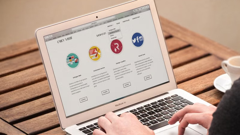
Web Design Tutorial: A Guide for Beginners—From Requirements Planning to Website Launch
2026/09/29 Learn web design step-by-step. Master site planning, wireframing, UI/UX, launch testing, and modern SEO/GEO best practices for a successful website.

